Flight Site UX
User Interview | Interactive Prototype | Usability Testing
Summary
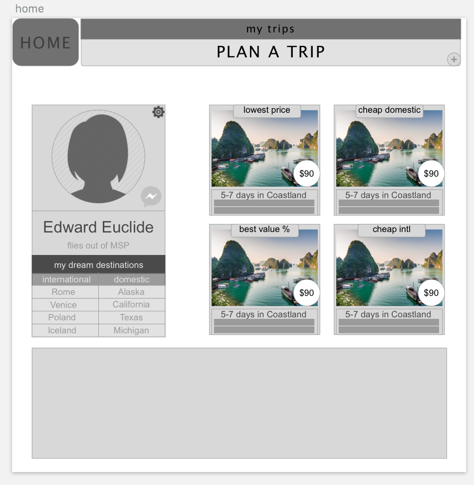
a more contained flight-booking experience
Over six-weeks I took this website project from creative-conception up to its first prototype testings. The goal was to create an online flight-booking experience for users coordinating travel with a companion. The website simulates natural narrowing-down processes for booking and assists users with companion coordination all the way through payment.
Research
I went right to the user on this, beginning with 1-on-1 interviewing in a directed storytelling format. I synthesized these interviews into a user-goal which served as our guide throughout the process. After exploring industry standards, I began deliberating site content and functionality.
Idea / Plan
I started with paper and pen. I made paper prototypes to test concepts. After these proof-of-concept sketches, I created a series of low-fidelity wireframes. I then broke-out to designing the total user-flow. After more dialogue and feedback I revised these wireframes to better contain the user-info gathering process.
Test
Using AxureRP I created an interactive prototype of our main innovation, the dynamic-panel questionnaire for user-info gathering. After more feedback, I filled out the design with more pages and a finished booking process. I then designed and conducted a series of in-person user tests with this prototype in mind. I synthesized that research into a report for my client.
Research
Interviews
Start with the user! I began by conducting 30 minute, directed-storytelling interviews with users surrounding an experience they had booking a flight online. This storytelling technique allows me to gain a sense of where the experience broke down for them and get a sense of underlying motivations & emotions. Being brought in so early in the process allowed me to inform the entire creative direction of the project. This type of broader-experience research was pivotal for shaping decisions on content and functionality throughout the process.
Report
After these interviews I identified pain-points surrounding the users trust of their search results and feelings of being overwhelmed by (as User B stated) "all the moving parts." I then conducted research of industry standards, getting a closer look at the break-downs my users described. All my users mentioned a "narrowing-down" process that they used to decide. Through sketching and search engines, I began researching ways this site might simulate these natural processes.
Plan
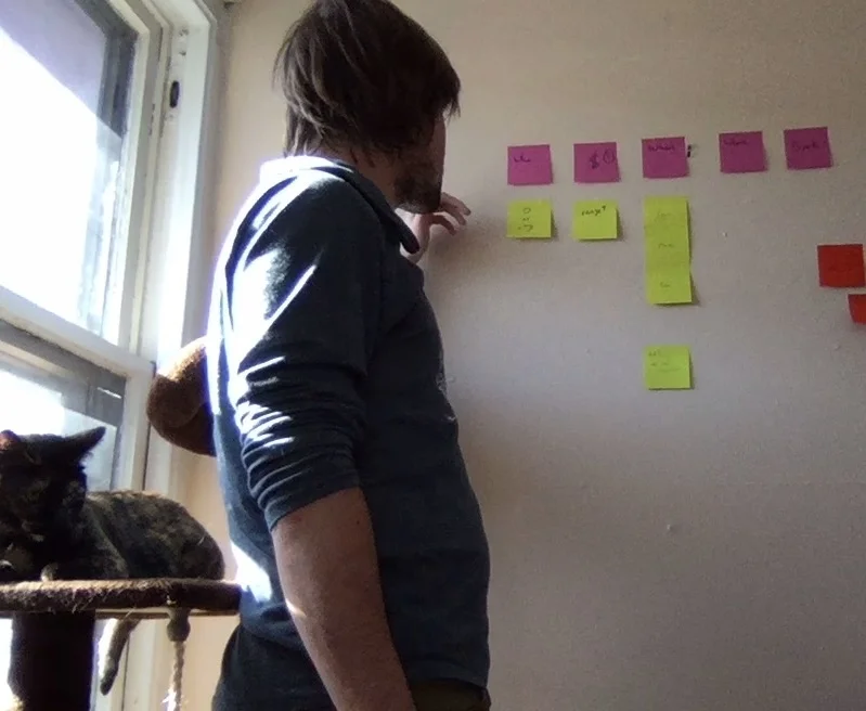
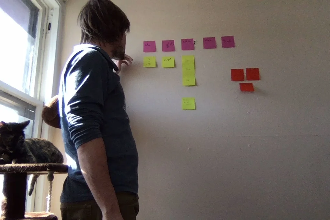
Early Concept
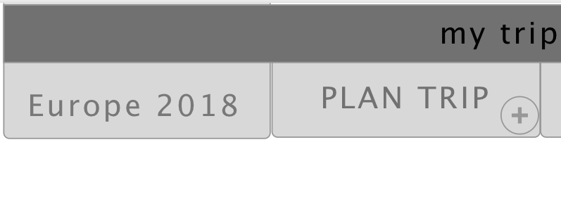
I first used paper wireframes and prototypes to begin exploring user flows and organizations. I then made a series of low-fidelity digital wireframes. With the website concept still shifting I kept my wireframes very low-fi, to facilitate more general feedback and discussion with the client.
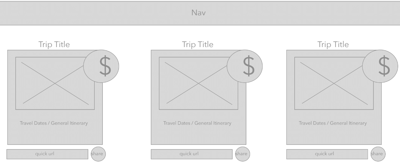
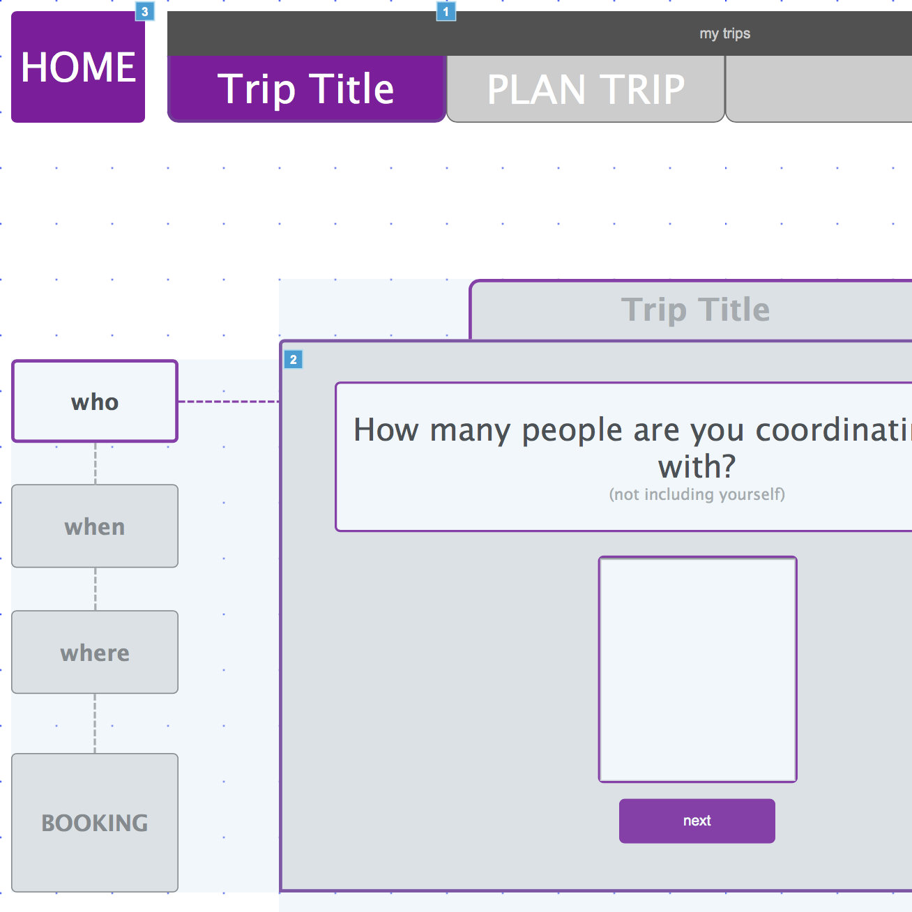
Navigation
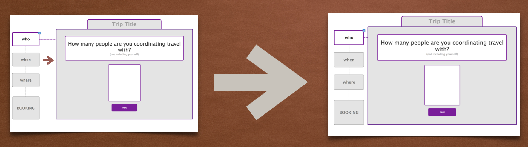
After this feedback I started refining the navigation, filling it in with a grayscale organization hierarchy.. I ultimately decided on the tabbed navigation for its significance with form-filling and its ability to simplify our navigation. After more feedback I added more detail to the tabs, clarifying functionality.
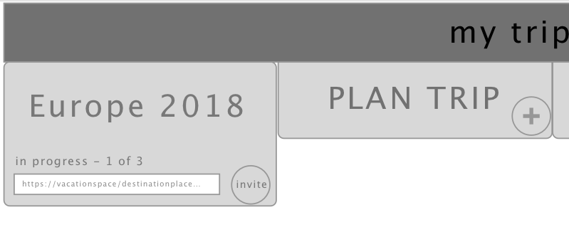
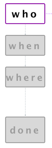
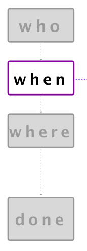
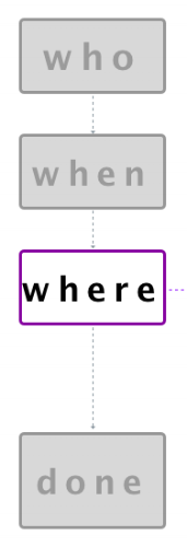
After settling on the questionnaire format, I decided the user would need a way to track their progress within the process. I built a few different "tracking" navigations but ultimately landed on a sidebar navigation finding it to be the most distinguishable navigation.
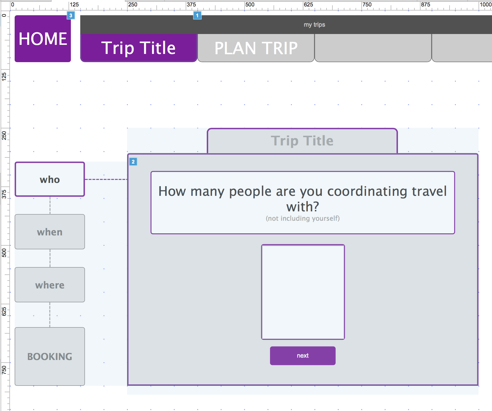
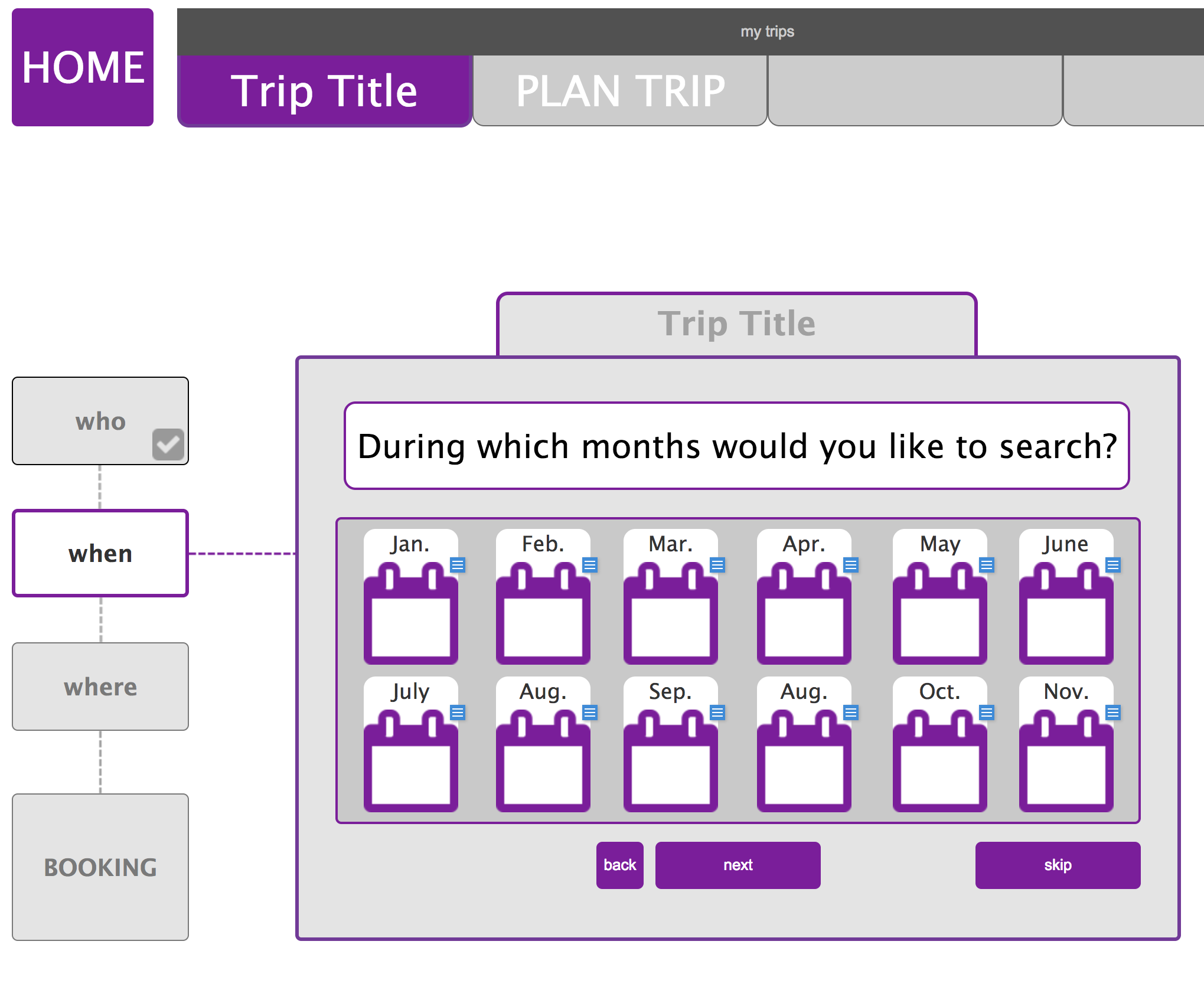
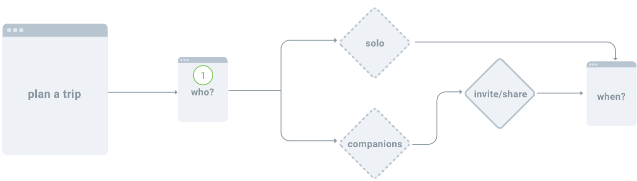
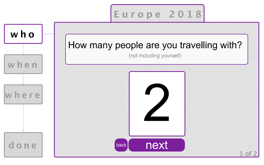
Dynamic-Panel Questionnaire
In order to reduce the users feeling of "too many moving parts" within the flight-booking experience, we moved our info-gathering to a single dynamic box. It takes the form of a "quiz" or questionnaire with easy to answer, single questions.
Test
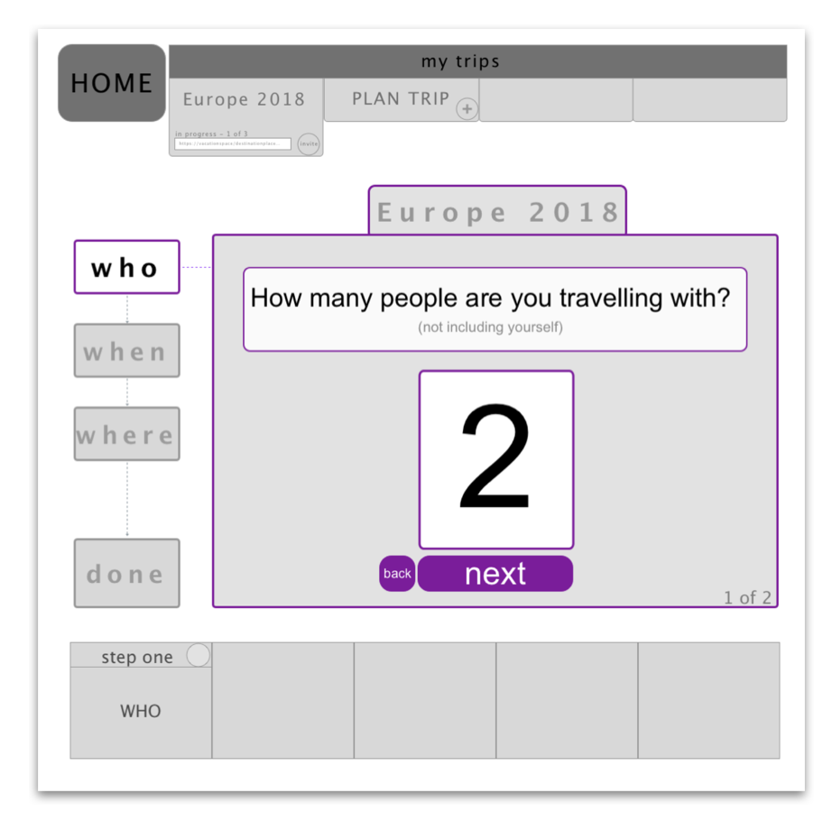
Interactive Prototype
Using AxureRP I created an interactive prototype for testing our primary user-tasks, such as the tabbed navigation, sidebar and dynamic box questionnaire. I refined this prototype after feedback from my team, filling out the site for the tests; adding pages and a final payment experience.
TESTING
I did a series of 1-on-1 user tests. I designed a script and conducted the tests in-person myself. These tests revealed break-downs within our own experience which I synthesized into a report, recommending re-designs and easy-fixes. For example, I found that the side-nav needed to be moved closer in proximity to the dynamic-box, for clarity of function and ease of access.